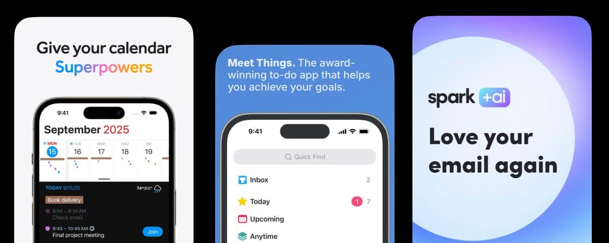
I've been building iOS and macOS apps for a while, and there's one thing I kept getting wrong after shipping: the screenshots.
I treated them like a design task. Pick five good screens, add overlay text describing the features, and export at the right sizes. Done. Meanwhile, downloads were flat (I'm looking at you: Super Easy Slides).
Here's what I learned from Theodora: 70% of screenshot effectiveness comes from the text overlay — not the UI. One app saw an 80% conversion lift just from rewriting the copy on existing screenshots.
The design didn't change.
The words did.
This is the thing most developers never fix.
Want the Full Playbook?
Download the App Store Screenshot Optimization Playbook — 100 best practices drawn from @DesignerAnts, the expert behind 1,000+ App Store screenshots. Drop it into Claude or Codex and fix your listing this afternoon.
*Want her to do it for you? Hire Theodora →*
The mistake is easy to make
When you're deep in building, you know your app inside out. So when it's time to write screenshot text, you naturally describe what the app does:
- "Dark mode support."
- "iCloud sync."
- "Customizable widgets."
Those statements are true. They're also completely useless to someone who doesn't know why they'd want your app.
Feature descriptions answer the wrong question. A user scanning your App Store page isn't asking "what does this app do?" They're asking "is this for me?" Feature lists don't answer that.
Your screenshots read like patch notes to someone who hasn't bought in yet.
What actually works
Change your mindset: stop describing features. Show what changes for the user.
- Not: "customizable dashboard"
- Rewrite: "see everything that matters, at a glance."
Another example:
- Not: "workout tracking"
- Rewrite: "you'll never forget what you lifted again."
Same app. Same screen. Different download rate.
The reason this works: specificity makes the promise real. "Productivity app" is invisible. "Never lose a meeting note again" is a reason to download. The more precisely you describe the user's life after your app, the more they can see themselves using it.
Cover your UI with your hand and read only the text. Does it tell a story? Or does it list features?
Most apps fail this test immediately. Mine included.
The sequence that converts
Your screenshots should only make sense in order. If they work in any sequence, you have a catalog, not a story.
Here's the sequence @designerants recommends:
1. Screenshot 1 — Name the pain. Their frustration, before they found you. ("Buried in notes you'll never find again?")
1. Screenshot 2 — State the shift. What changes when they use your app. ("Everything you capture, organized automatically.")
1. Screenshot 3 — Show proof. Numbers, users, and a concrete result. ("Used by 10,000 developers every day.")
1. Screenshots 4–5 — Feature delivery. The one or two capabilities that actually deliver the promise from Screenshot 2.
Each screenshot does one job. One message. If it needs two sentences to explain, split it into two screens.
One more rule: text is the product
Your UI is evidence. Your text is the argument.
Write the headline for each screenshot before designing the screen. If you can't say the change in 8 words, you don't understand it well enough yet. Then let the UI behind it serve as the visual proof.
Treat the words as the product. Everything else is supporting material.
What I Shipped vs. What I’d Ship Now
I never planned to publish this app. I built it for myself.
But a friend asked about it—so I quickly put together my App Store sales page before I discovered these screenshot tactics.
This is the copy Super Easy Slides launched with:
- Notes -> Slides. Instantly.
- Full Screen Always Readable.
- Slides Over Any App.
- Auto-Numbering that Works.
At the time, this felt right.
I was trying to:
- Clearly explain what the app does
- Highlight key features
- Keep everything simple and direct
And on paper, it checks out.
What’s wrong with this
Looking at it now, the problem is obvious:
This describes the product—but it doesn’t sell it.
- These read like feature labels, not headlines
- There’s no clear user pain or motivation
- Nothing really *grabs attention* or stops the scroll
- It assumes the user already understands why this matters
This is the mistake I made:
I focused on what the app does instead of why someone would want it.
The rule I missed
From Theodora’s approach:
Each screenshot should work like an ad.
That means:
- Lead with a pain or desire
- Show the outcome
- Support it with the feature
Not the other way around.
What I’d change
Here’s how I’d rewrite the same ideas:
Before Notes → Slides. Instantly.
After Stop Designing Slides Write notes. Start presenting.
Before Full Screen Always Readable After Stay Focused While You Present Clean slides. No distractions.
Before Slides Over Any App After Stay In Your Flow Present without breaking your momentum.
Before Auto-Numbering that Works After Never Fix Slides Manually Again Your structure stays clean automatically.
Why this is better
The new version:
- Leads with outcome, not implementation
- Makes sense instantly (even to non-developers)
- Connects to real pain: time, focus, clarity
- Uses the feature as support—not the headline
What to do this week
You don't need a designer. You need an afternoon.
Pull up your screenshots. Cover the UI. Read only the headlines out loud. Rewrite anything that sounds like a feature list. Then run the new version for 30 days and check the conversion rate in App Analytics.
One rewrite session will tell you more than months of keyword optimization.
100 App Store Screenshot Best Practices
These best practices come from @Designerants — the ASO expert who's optimized 1,000+ App Store screenshots and driven an 80% conversion lift for one app alone.
I distilled her work into a free PDF: 100 App Store Screenshot Best Practices. Feed it to Claude or Codex and rewrite your listing today.
*Building iOS and macOS apps with AI tools? I write about the workflows I'm using with Codex and Xcode. Follow *@PaulSolt